Below you will find several examples of different CV sections. Look at the lay-out and the format. What do you notice? What would you like to improve?
In the right-hand column you'll find the same fragments as a word-file. You can use those to make the necessary improvements.
You will sometimes need to improve the wording. You do not need to change the content.
Exercise 1
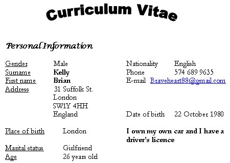
Word Art and fancy fonts do not belong in a CV. Use a more formal font and stick to it. Avoid using more than one font type as this gives a messy impression. Do not combine bold print with underlining and italics. It is too much. Also be consistent with tabs and combine the information that belongs together.
There is a lot of information in this section that can be left out. The labels for instance, are often not needed. The same goes for the title. Writing "Curriculum Vitae" over your CV might be stating the obvious. Marital status and place of birth can easily be discarded of. Information concerning one's driver's licence does not belong in this section.
In a professional CV, professional contact details are necessary. Get rid of funny e-mail addresses and create on of the "name.surname@provider.com" type.
Exercise 2
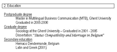
Do not use numbers or colons in your headings. Provide enough of white space and ensure that the line space is not too small, as is the case here. Because of several reasons, this cv is hard to scan for information.
oversized tabs slow the reading down
the lack of clear layout. There is no formatting apart from the underlined headings.
the lack of consistency in the presentation of information, e.g. dates. Somertimes the dates are placed in between brackets and sometimes they are not. In a CV, dates are vital, so they can definitely be highlighted. Brackets are not necessary.
redundant information; there is no need for the subheadings or the words "graduated in"
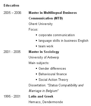
An alternative might look like this:
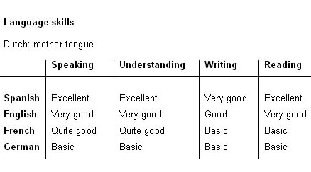
Exercise 3
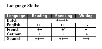
Combining bold print with underlining is a bit heavy, as is the dark shading with the white print. Do not use colons in headings. Remember to use a hierarchic order when listing the different languages.
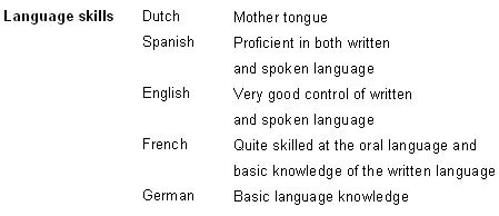
It is not recommendable to use symbols to graphically depict language skills. Not only does it look quite appalling, but it leaves the recruiter guessing about the value of each plus or minus symbol. Instead of using these symbols, you could consider referring to the Common European Framework of Reference for Languages (CEF).
If you use a table in your CV, it should contain enough white spacing and the columns and rows should have the same height and width. Also be consistent and complete with the use of terminology. It is either: speaking - understanding - writing - reading or: written - spoken. Depending on the ad, you can decide to include more or less parameters.